
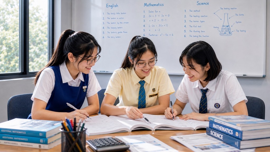
How Multimodal Reading Works Across Words, Images, Captions and Layout is the broad visual and multimodal literacy owner for eduKate Sengkang. It explains how readers construct meaning when information is distributed across prose, photographs, diagrams, charts, captions, typography, icons, colour and page structure.
The focus keyword family includes multimodal reading, visual text, images and words, captions, layout, visual literacy and English reading comprehension. Existing year-specific visual-text and multimodal pages remain protected specialist owners.
The central principle is evidence integration. The image does not automatically override the words; the words do not automatically contain all the meaning. Strong readers identify what each mode contributes, how the modes relate and what the full text allows them to conclude.
A multimodal text is not prose with decoration. It is a designed field in which meaning is distributed across several coordinated forms.
1. Multimodal reading means reading more than sentences
Modern texts often combine words, images, captions, diagrams, typography, colour, icons, layout and spatial relationships. The reader must integrate these modes rather than treat the page as prose plus decoration.
A photograph may supply evidence that the paragraph only hints at; a caption may narrow what the photograph actually shows; a heading may tell the reader how to group several visual elements.
Multimodal reading is therefore a coordination skill: the meaning sits partly in each mode and partly in the relationship among them.
2. This page owns the broad multimodal-reading route
eduKate Sengkang already has year-specific pages on visual texts, advertisements, posters, diagrams, tables, multimodal persuasion and digital reading. Those specialist pages remain protected.
This article sits above them as the cross-age conceptual owner: how words, images, captions and layout work together, how readers should evaluate them, and how the skill progresses from Primary reading into Secondary English.
Its job is to provide the common architecture without duplicating the specialist estate.
3. The official English syllabuses recognise multimodal texts
MOE’s English Language syllabuses include viewing and representing alongside listening, speaking, reading and writing, and refer to print, non-print and multimodal texts.
This matters because school English is not restricted to continuous prose.
Students need a literacy system that can interpret meaning across modes and explain how those modes support purpose and audience.
4. A multimodal text has several evidence channels
Words carry explicit propositions; images can show setting, emotion, comparison or data; captions identify or qualify; layout creates hierarchy; colour and typography direct attention.
No single channel should automatically dominate.
The reader should ask what each mode contributes and whether the modes reinforce or complicate one another.
5. The first reading move is to identify the text’s purpose
A public-information poster, advertisement, infographic, school notice and news page may use similar visual devices for different goals.
Purpose affects what evidence matters.
Before interpreting one feature, ask what the text appears to be trying to help the audience know, feel or do.
6. The second move is to identify the intended audience
A text designed for young children, commuters, parents or professionals will select different language, imagery and information density.
Audience shapes vocabulary, icon choice, tone and layout.
The reader should infer audience from the whole design rather than one clue alone.
7. The third move is to locate the hierarchy
Readers need to know where the page wants the eye to go first, second and third.
Size, placement, whitespace, contrast, headings and image prominence create hierarchy.
Hierarchy is not automatically manipulation; it is how visual communication manages limited attention.
8. The fourth move is to read every caption
A caption can identify who or what appears, provide date or location, explain a chart or correct a misleading first impression.
Skipping captions can change the meaning of the visual.
Captions are evidence, not labels to ignore.
9. The fifth move is to read source and date where available
A graph without source or date may be less useful for a current claim. A photograph from another year can be visually powerful but contextually misleading if treated as current.
Source information changes confidence.
Multimodal reading includes provenance when the text provides it.
10. The sixth move is to integrate words and visuals
Ask what the image shows that the words do not, and what the words explain that the image cannot.
If both modes merely repeat the same point, the relationship is reinforcement. If one adds detail or qualification, the relationship is complementary.
Integration is stronger than analysing each mode separately.
11. Images can provide literal information
A labelled diagram may identify parts; a photograph may show spatial arrangement; a map may locate places.
The reader should state what is actually visible before interpreting.
Literal visual reading is the foundation for later inference.
12. Images can imply attitudes or emotions
Facial expression, angle, distance, gesture and selected moment can influence how a person or event appears.
Students should distinguish what can be observed from what is inferred.
The same evidence discipline used in prose applies to images.
13. Images can frame a topic selectively
A text may choose one dramatic photograph from many possible images.
That selection can direct attention toward one aspect of an issue.
Students should notice framing without assuming malicious intent.
14. Cropping changes available context
A close crop can intensify emotion or remove surrounding information.
Readers usually cannot know what lies outside the frame unless another source shows it.
Cropping should therefore be analysed through what is visible and what context is absent, not through unsupported speculation.
15. Camera angle can shape perception
A low angle may make a subject appear larger or more imposing; a high angle may create distance or vulnerability.
These effects are context-dependent.
Students should explain the local consequence rather than memorise one universal rule.
16. Distance changes intimacy
A close-up foregrounds expression or detail; a wide shot shows environment and scale.
The choice can change what the reader notices first.
Visual distance is part of information selection.
17. Colour can organise and signal
Colour may group categories, create contrast, indicate warning or build brand identity.
Meaning depends on convention and context.
Students should avoid universal claims such as “red always means danger”.
18. Typography can create hierarchy and tone
Size, weight, spacing and font choice can distinguish headline, body, warning or call to action.
The reader should ask what receives emphasis and whether the typography affects accessibility.
Typography carries function before style.
19. Whitespace is meaningful
Empty space can separate sections, reduce clutter, isolate a focal element or create calm.
A dense page creates different navigation demands from a sparse one.
Layout includes what is not filled.
20. Alignment helps group information
Items that line up often appear related; uneven placement can create hierarchy or movement.
Readers use alignment unconsciously to infer grouping.
Explicitly noticing it can improve navigation of complex pages.
21. Proximity suggests relationship
Elements placed near one another are often interpreted as connected.
A caption beside the wrong image can therefore create confusion.
Spatial relationship is part of syntax in visual design.
22. Icons compress recurring meanings
Arrows, warning symbols, transport icons and interface symbols can communicate quickly across limited space.
Students should learn conventional meanings while remaining alert to context.
An unfamiliar icon should be interpreted alongside words and surrounding design.
23. Arrows can show direction or causality
In a process diagram, arrows may show sequence; in a concept map, they may show influence or relationship.
The reader should determine what the arrow means in that specific visual system.
Graphic conventions need interpretation just as conjunctions do in prose.
24. Labels anchor visual reference
A diagram becomes much easier to interpret when labels connect words to exact parts.
Missing or ambiguous labels increase uncertainty.
The reader should check whether the answer comes from the picture, label or both.
25. Legends decode visual systems
Maps and charts often use colour, line type or symbol categories that only become meaningful after the legend is read.
Skipping the legend can invert the interpretation.
The legend is part of the text.
26. Axes control graph meaning
A graph is not simply a shape. Students need to read variable names, units, intervals, scale and baseline.
A steep-looking line may represent a small change if the axis is truncated.
Visual evidence requires quantitative literacy.
27. Tables require row–column coordination
The reader must identify the correct heading before interpreting a cell.
Misaligned scanning can produce an accurate number from the wrong category.
Table reading is structured navigation.
28. Infographics combine compression and persuasion
An infographic may present facts while also choosing which facts to highlight and how dramatically to display them.
Students should separate data from design emphasis.
The visual can be informative and rhetorically shaped at the same time.
29. Maps require spatial reasoning
Scale, orientation, labels, legend and route lines contribute different information.
A map may be geographical, conceptual or schematic.
The reader should identify what kind of space is being represented.
30. Timelines require temporal hierarchy
Events are placed in relation to time, but spacing may or may not be proportional.
Students should inspect dates rather than infer duration only from visual distance.
Visual sequence can simplify history while also hiding complexity.
31. Advertisements coordinate modes around persuasion
Headline, image, product placement, colour, slogan and fine print may work together to direct attention and encourage action.
The reader should identify both the explicit claim and the design choices that support it.
Persuasion is strongest when analysed as a system rather than a list of features.
32. Public-information texts coordinate modes around action
Safety notices, health posters and transport signs often prioritise speed, clarity and actionability.
Icons, colour and concise wording reduce reading time.
Effectiveness should be judged against the communication purpose.
33. News pages coordinate modes around framing and navigation
Headline, photograph, caption, pull quote, chart and article text can create different entry points.
The reader should not infer the entire story from the headline-image pair.
Read the supporting text before forming a final interpretation.
34. Educational diagrams coordinate modes around explanation
A Science diagram, Mathematics model or labelled process image can represent relationships that are cumbersome in prose.
English reading strategies can help with labels, sequence and explanation.
Subject-specific meaning should still remain with the relevant discipline.
35. Digital interfaces are multimodal texts too
Menus, buttons, icons, alerts, tabs and information cards tell the user where to go and what can be done.
Interface literacy includes interpreting labels, hierarchy and feedback.
Reading on screen involves navigation as well as comprehension.
36. A photograph is evidence of what is visible, not automatically of the wider claim
A photograph can show that a person, place or event appeared a certain way at one captured moment. It cannot by itself establish frequency, cause or representativeness.
Students should separate observation from generalisation.
Visual evidence needs scope just like verbal evidence.
37. Captions can strengthen or weaken a visual claim
A caption may confirm date and location, or reveal that the image is illustrative rather than documenting the exact event being discussed.
Students should read image and caption together before drawing conclusions.
The caption can change the evidential status of the visual.
38. Headlines can prime interpretation
Readers often encounter the headline before the article or image. That wording can frame expectations and direct attention.
A strong reader treats the headline as one part of the text, not as the whole claim.
Later evidence may qualify the initial frame.
39. Pull quotes create selective emphasis
A quotation enlarged on a page may feel more important than surrounding sentences because of visual prominence.
Students should check whether it is representative of the wider argument.
Design prominence is not the same as evidential strength.
40. Fine print can contain essential conditions
Advertisements, notices and online offers may place limitations in smaller text.
The visual hierarchy can make those conditions easy to overlook.
Reading critically includes searching for constraints that change the headline claim.
41. Data labels are part of the argument
A chart without units, categories or clear labels cannot be interpreted safely.
Students should identify what each axis or segment represents before describing a trend.
Visual literacy begins with accurate decoding.
42. Scale can exaggerate or compress differences
A chart that starts its vertical axis above zero can make a modest difference look dramatic. A very wide scale can make meaningful change look flat.
Students should inspect the numerical range.
Shape alone is not enough.
43. Percentages need a base
Fifty per cent of ten people is different from fifty per cent of ten thousand.
The visual may foreground percentage while hiding sample size.
Readers should ask what population or denominator the percentage describes.
44. Averages can hide distribution
A single average may conceal wide variation among individuals or groups.
Students should avoid assuming everyone is close to the average unless the data show that.
One summary number rarely tells the whole story.
45. Pie charts require a meaningful whole
A pie chart implies that slices belong to one complete total.
If categories overlap or do not sum sensibly, the format can mislead.
Students should check what the whole represents.
46. Bar charts invite category comparison
The reader should compare like with like and check whether bars share the same baseline and unit.
Three-dimensional styling can distort perceived size.
Decorative design should not override numerical reading.
47. Line graphs imply ordered progression
Time is common on the horizontal axis, but not every line graph represents time.
Students should inspect what is being ordered and whether intermediate points are meaningful.
A line creates a sense of continuity that the data may or may not justify.
48. Scatter plots show relationships, not automatic causation
A pattern between two variables can indicate association.
It does not by itself prove that one variable causes the other.
Visual reasoning should preserve the same causal discipline as prose.
49. Tables can reveal detail that charts compress
Charts make patterns visible; tables preserve exact values and categories.
Students should know when to move from a visual overview back to precise numbers.
Different modes support different reading jobs.
50. Diagrams may simplify real systems
A diagram often removes irrelevant detail so a relationship becomes visible.
That simplification is useful but can hide exceptions, scale or complexity.
Students should distinguish model from reality.
51. Flowcharts encode process
Boxes, arrows and branches can represent sequence, choice and consequence.
The reader should identify entry point, decision points and possible endpoints.
A missed arrow can change the entire process model.
52. Concept maps encode relationships, not sequence alone
Lines may mean cause, category, similarity or association rather than time.
Labels on the links matter.
The reader should determine the relationship represented by each connection.
53. Maps can distort size or distance depending on projection or schematic purpose
A transit map may prioritise route clarity rather than geographical accuracy.
A world map may distort area.
The reader should identify what the map is designed to preserve.
54. Heat maps use intensity to direct attention
Colour strength can represent frequency, risk, density or another measure.
The legend determines the meaning.
Students should resist interpreting bright colour emotionally before checking the scale.
55. Before-and-after images need controlled comparison
Different lighting, angle, crop or scale can create the appearance of change.
Students should ask whether the two images are comparable.
Visual comparison needs consistent conditions.
56. Screenshots preserve one interface state
A screenshot can document what appeared on a screen at one moment.
It may become outdated or omit interaction history.
Use date and context where those matter.
57. Thumbnails create first-impression framing
Video and article thumbnails are designed to attract attention in limited space.
They may exaggerate emotion or select a dramatic moment.
The thumbnail should not substitute for the full source.
58. Social-media cards compress context
A post may combine image, short caption, username, metrics and comments in one visual field.
Readers should separate source identity, original claim, audience reaction and platform metadata.
Popularity indicators are not evidence that the claim is true.
59. Engagement metrics are not quality metrics
Likes, shares and view counts measure attention or interaction, not accuracy or expertise.
High engagement can reflect controversy, entertainment or distribution.
Students should not confuse visibility with reliability.
60. Verification badges or branding require context
A visual badge can indicate account status or platform information, but readers should understand what that badge actually certifies.
It may not validate every claim made by the account.
Visual trust signals need interpretation.
61. Hyperlinks create branching reading
Digital readers can leave the main page through linked sources, definitions or related material.
A link may support verification or create distraction.
The reader should decide whether following it serves the current task.
62. Menus create information architecture
Navigation labels tell readers how the site groups content.
A poorly understood menu can cause a search failure even when the information is present.
Digital literacy includes knowing how sites organise knowledge.
63. Search bars change reading into retrieval
When looking for one fact, readers may search keywords rather than read continuously.
This is efficient only if the target term is well chosen.
Search does not replace understanding once the relevant section is found.
64. Pop-ups compete for attention
Notifications, cookie banners, promotions and chat widgets can interrupt reading.
Students should learn to restore the main task after interruption.
Attention management is part of digital comprehension.
65. Scrolling changes spatial memory
On long pages, readers may lose where a section sits relative to earlier information.
Headings, browser find and note cues can support navigation.
Digital layout changes the memory demands of reading.
66. Tabs can support comparison or fragment attention
Keeping several sources open can make cross-checking easier.
Too many tabs can also create search noise and duplicate information.
Source management is part of multimodal digital reading.
67. Embedded video changes the evidence mode
A page may rely on video for demonstration while prose provides context or interpretation.
Students should decide whether the video is primary evidence, explanation or illustration.
Watching and reading should be integrated.
68. Audio adds tone and timing
Spoken delivery can convey emphasis, hesitation and emotion that a transcript may not fully preserve.
A transcript can make wording easier to verify.
Different modes can complement one another.
69. Subtitles are another textual layer
Subtitles can support access but may contain timing limits, paraphrase or errors.
Readers should not assume every subtitle is a perfect transcript.
Where exact wording matters, verify against the source if possible.
70. Interactive graphics require user choices
Hovering, filtering or selecting categories can reveal data not visible in the default view.
The reader becomes partly responsible for which evidence appears.
Interactive reading includes documenting the chosen settings when necessary.
71. Filters can change the story
A chart showing one age group or time period may look different after another filter is selected.
Students should note what population is currently displayed.
The interface state is part of the evidence context.
72. Sort order influences salience
A list sorted by popularity creates a different first impression from one sorted alphabetically or chronologically.
Readers should check the sorting rule.
Order can guide attention without changing the underlying items.
73. Recommendation systems shape what is encountered
Digital platforms often decide which items appear first based on system criteria.
Readers may mistake a personalised feed for a neutral overview.
Multimodal literacy includes awareness that visibility can be curated.
74. Accessibility features are part of good multimodal design
Alt text, readable contrast, captions, scalable text and clear headings help more users access information.
Students can evaluate whether a design communicates beyond the ideal viewer.
Effectiveness includes accessibility.
75. Alt text translates visual information into language
Alternative text can describe an image for users who cannot see it and can also reveal what the publisher considers essential.
Good alt text is selective and purposeful.
It demonstrates that multimodal meaning can be re-represented across modes.
76. Primary 1 multimodal reading begins with matching and orientation
Young readers can learn to connect labels to pictures, follow simple signs, identify headings and explain what an illustration contributes to a story.
The first goal is not formal design vocabulary.
It is understanding that meaning can be distributed across word and image.
77. Primary 2 can begin comparing modes
Ask what the picture shows that the sentence does not, or what the caption explains about the picture.
This creates an early integration habit.
The child begins to see modes as complementary sources of meaning.
78. Primary 3 can begin reading simple charts and functional layouts
Tables, maps, posters and simple infographics can be used to practise headings, labels, legends and sequence.
Students should explain where they found the information.
Navigation becomes part of comprehension.
79. Primary 4 can deepen visual evidence
Readers can compare explicit wording with image evidence, interpret more complex tables and notice how headings organise information.
Questions can ask which mode provides the strongest support.
Evidence integration becomes more deliberate.
80. Primary 5 can add purpose and persuasion
Students can ask what a poster, advertisement or campaign text wants the audience to think or do.
They should connect visual features to purpose.
This builds a bridge into Secondary visual-text analysis.
81. Primary 6 can add source and reliability habits
Readers can begin checking source, date, labels and whether a statistic or image actually supports the claim.
The reasoning remains age-appropriate.
PSLE preparation can still develop real information literacy.
82. Secondary 1 should make multimodal structure explicit
Students can analyse how headline, image, caption, layout and wording combine around audience and purpose.
The key shift is from naming features to explaining function.
One strong relationship is better than a long feature list.
83. Secondary 2 should add source and evidence evaluation
Readers can ask whether a chart is properly labelled, whether an image is representative and whether the source is appropriate for the claim.
Design and evidence should be considered together.
This prepares students for more complex digital texts.
84. Secondary 3 should add stronger persuasion and comparison
Students can compare how two multimodal texts frame the same issue through different images, evidence and layout.
They should identify the common axis of comparison.
Evaluation becomes more important than feature identification.
85. Secondary 4 should integrate multimodal reading under time
The learner should navigate complex visual and verbal evidence efficiently, avoid overinterpretation and answer precisely.
Current examination formats should be verified for the cohort.
The deeper skill remains transferable beyond the paper.
86. Error profile: the reader ignores the visual
The student reads only prose and misses information carried by a chart, map or photograph.
Ask which question cannot be answered from words alone.
The repair is mode awareness.
87. Error profile: the reader ignores the words
A dramatic image controls interpretation while captions or prose provide important qualification.
Require a verbal evidence check before accepting the conclusion.
The repair is cross-mode integration.
88. Error profile: the reader treats design as fact
A large number, bright colour or bold headline feels important, so the learner assumes the claim is strong.
Separate visual emphasis from evidence strength.
The repair is evidential calibration.
89. Error profile: the reader misses hierarchy
The student reads small supporting text first and fails to understand the main route through the page.
Teach headline → section → detail navigation.
The repair is layout orientation.
90. Error profile: the reader misses labels
A correct chart value is taken from the wrong row, axis or category.
Require label verification before interpreting numbers.
The repair is structured navigation.
91. Error profile: the reader misreads scale
A steep graph line is interpreted as a large absolute change even when the numeric range is narrow.
Teach axis inspection before pattern description.
The repair is quantitative visual literacy.
92. Error profile: the reader overgeneralises from one image
One photograph is treated as proof of a general population claim.
Ask what the image can establish and what it cannot.
The repair is scope.
93. Error profile: the reader confuses popularity with credibility
High view counts or many shares are treated as proof that a source is reliable.
Separate engagement metrics from evidence quality.
The repair is digital-source judgement.
94. Error profile: the reader follows every hyperlink
The student opens many related pages and loses the original task.
Teach a purpose check before following links.
The repair is digital navigation control.
95. Error profile: the reader never follows supporting links
The student accepts a claim on the main page even when a linked source is necessary for verification.
Teach when source-following matters.
The repair is selective verification.
96. Error profile: the reader treats caption as decoration
The student can describe the image but misses date, location or source information in the caption.
Make caption reading a routine.
The repair is evidence completeness.
97. Error profile: the reader treats colour symbolically without context
The student writes that red means danger even when red simply marks one data series.
Return to legend and local function.
The repair is context-bound interpretation.
98. Error profile: the reader names features without explaining effect
The student lists bold font, image and colour but does not connect them to audience or purpose.
Require feature → function → consequence.
The repair is explanatory reasoning.
99. Error profile: the reader explains effect without evidence
The student claims the page is “persuasive” but cannot identify the design or wording that produces that effect.
Return to a specific feature.
The repair is visual evidence.
100. Error profile: the reader cannot integrate two modes
The student gives separate comments on image and prose but never states how they reinforce, qualify or contradict one another.
Teach relational language such as supports, adds, contrasts and narrows.
The repair is integration.
101. Error profile: the reader cannot switch from overview to detail
The student either stares at the whole page vaguely or gets lost in one data point.
Teach overview first, target second, verify third.
The repair is scale switching.
102. Error profile: the reader misreads interface state
A filtered chart or sorted list is interpreted as if it represents the default or whole dataset.
Ask which settings are active.
The repair is interactive-context awareness.
103. Error profile: the reader cannot identify the source hierarchy
A repost, screenshot and original source are treated as equivalent.
Trace the information back to the publisher or underlying evidence where possible.
The repair is provenance.
104. Error profile: the reader overtrusts professional design
A polished infographic feels credible because it looks authoritative.
Ask who produced it, what data support it and whether labels are complete.
Design quality and evidence quality are different.
105. Error profile: the reader distrusts all persuasive design
Another student assumes every advertisement or campaign text is false because it is persuasive.
Teach purpose awareness without automatic rejection.
Critical reading is calibrated, not cynical.
106. Error profile: the reader cannot handle dense pages
Too many boxes, icons and text blocks create overload.
Teach hierarchy scanning and section-by-section reading.
The repair is attentional routing.
107. Error profile: the reader gets lost after scrolling
The student cannot relocate evidence on a long digital page.
Use headings, browser find or brief section notes.
The repair is spatial navigation.
108. Error profile: the reader cannot describe a visual pattern precisely
The student writes “it goes up a lot” rather than identifying period, magnitude or comparison.
Teach evidence language such as increased gradually, peaked, remained stable or differed by category.
The repair is visual-to-verbal representation.
109. Error profile: the reader invents cause from a chart
A graph shows two variables rising together and the student claims one caused the other.
Separate observation from explanation.
The repair is causal discipline.
110. Error profile: the reader cannot paraphrase an infographic
The learner can point to the information but cannot turn it into a clear sentence.
Ask what the graphic is saying in ordinary language.
The repair is representation.
111. Multimodal comprehension can be tested orally
Ask the learner to explain what each mode contributes and which evidence supports the answer.
This removes handwriting load.
Oral explanation can reveal whether the visual model is coherent.
112. Multimodal comprehension can be tested through drawing
Ask the student to turn a paragraph into a simple diagram or a diagram into prose.
The translation exposes whether relationships were understood.
Representation across modes deepens comprehension.
113. Multimodal comprehension can be tested through redesign
Give a cluttered information page and ask how to improve hierarchy without changing the facts.
The student must identify which information is primary and supporting.
Design becomes a comprehension test.
114. Multimodal comprehension can be tested through comparison
Present two posters with the same purpose and ask which design choices change reader attention.
Require evidence from both.
Comparison deepens visual reasoning.
115. Multimodal comprehension can be tested through verification
Give an infographic and ask which claims can be checked through the cited source.
The learner must move from presentation to evidence.
Verification is a powerful Secondary extension.
116. Multimodal reading should distinguish observation from inference
“The person is smiling” is observation; “the person is satisfied” is inference.
Both can be useful if labelled mentally.
The distinction prevents images from generating overconfident conclusions.
117. Multimodal reading should distinguish representation from reality
A map, diagram, photo and graph are representations shaped by selection and scale.
They can be accurate without being complete.
Readers should ask what aspect of reality the mode is designed to show.
118. Multimodal reading should distinguish evidence from ornament
Some visual elements carry factual or structural information; others mainly create atmosphere or brand identity.
The reader should identify which features matter to the question.
Not every design detail deserves analysis.
119. Multimodal reading should distinguish access from persuasion
A bright heading may simply help navigation, while a slogan may try to shape attitude.
The same visual technique can serve different functions.
Purpose should be inferred from context.
120. Multimodal reading should distinguish source from platform
A claim appearing on a social platform may originate from a government agency, newspaper, company or anonymous user.
The platform hosting the item is not necessarily the original source.
Trace provenance when it matters.
121. A repeatable multimodal method can begin with overview
Before reading every detail, identify the text type, probable purpose, main headline and dominant visual.
This creates an initial map of the page.
The overview should remain provisional until the evidence is checked.
122. Step two is to read the verbal spine
Read the main headline, subheadings, body text and captions enough to understand the explicit message.
Do not let the most dramatic image become the whole interpretation.
Words often provide scope, conditions and source information.
123. Step three is to decode the visual system
Identify chart axes, legend, icons, labels, image subjects, colour categories and layout hierarchy.
Ask what information each element encodes.
This prevents interpretation before decoding.
124. Step four is to connect the modes
State whether the image supports, illustrates, adds, qualifies or contrasts with the verbal message.
One relational sentence can reveal whether the text has been integrated.
Separate observations are not yet multimodal comprehension.
125. Step five is to inspect provenance
Look for source, date, publisher, data origin and any link to underlying material when those details are relevant.
A beautiful chart with no visible source may require more caution.
Provenance affects confidence.
126. Step six is to answer the actual question
Do not analyse every design feature because it is present.
Select the mode and evidence relevant to the task.
Good multimodal reading remains purpose-driven.
127. Step seven is to verify the answer across modes
Check whether another part of the page limits or contradicts the conclusion.
A caption, fine print or second chart may change the initial interpretation.
Verification protects against first-impression overreach.
128. Visual persuasion can operate through salience
Making one element larger, brighter or more central can cause it to dominate attention.
Students should distinguish salience from evidential weight.
The page can tell the eye where to look without proving the claim.
129. Visual persuasion can operate through selection
A campaign may choose one photograph, statistic or testimonial from many possibilities.
The selected element can be genuine while still framing the issue narrowly.
Critical reading asks what the selection supports and what remains unknown.
130. Visual persuasion can operate through juxtaposition
Placing two images or statements side by side can invite comparison even without an explicit sentence.
Students should state what relationship the layout implies.
Juxtaposition is a form of visual syntax.
131. Visual persuasion can operate through sequencing
A page can lead the reader from problem to evidence to solution to call-to-action through spatial order.
The sequence can create a persuasive narrative.
Layout therefore contributes to argument structure.
132. Visual persuasion can operate through social proof
Testimonials, ratings, follower counts or images of crowds can imply that many people approve.
Popularity may be relevant to some claims but does not establish truth.
Readers should identify what kind of evidence social proof actually provides.
133. Visual persuasion can operate through authority signals
Logos, uniforms, titles and institutional design can increase perceived credibility.
The signal may be meaningful when authentic and relevant.
It should still be connected to evidence and source identity.
134. Visual persuasion can operate through urgency
Countdowns, red banners, limited-time messages and alert symbols can encourage immediate action.
Urgency affects decision pace.
Readers should check whether the time pressure is part of the evidence or merely part of the persuasion.
135. Visual persuasion can operate through emotional imagery
Images of fear, joy, loss or aspiration can make an issue vivid.
Emotion can be legitimate communication.
The reader should still distinguish emotional force from factual support.
136. Design can improve comprehension without being persuasive
Clear headings, icons, diagrams and whitespace can reduce cognitive load.
Students should not interpret every strong design choice as manipulation.
Function depends on purpose and context.
137. Synthetic images create a new verification question
An image can be generated or heavily edited while still looking photographic.
Readers should avoid treating visual realism as proof of origin or event.
When authenticity matters, source verification becomes part of reading.
138. Edited images are not automatically deceptive
Cropping, colour correction, annotation and compositing can serve legitimate educational or design purposes.
The question is whether the editing changes the claim or hides relevant context.
Evaluation should focus on communicative consequence.
139. Watermarks and labels can provide provenance clues
A visible source label or generated-content notice may help identify origin.
Absence of a label does not prove authenticity.
Clues contribute to judgement but rarely settle it alone.
140. Reverse-image search can support verification when appropriate
Where tools and permissions allow, searching for earlier appearances of an image can reveal original context.
The method is useful for public-source verification.
The learner should still inspect the actual source rather than rely only on search thumbnails.
141. Metadata can sometimes help, but should not be assumed available
File dates, captions or embedded information may provide context.
Online platforms often strip or alter metadata.
Readers should treat metadata as one possible evidence source, not a guarantee.
142. A screenshot can preserve misinformation as easily as truth
The screenshot may faithfully capture a false post or an outdated statement.
Students should verify the underlying claim and source.
Image format does not confer reliability.
143. Quotations inside images require source checking
A graphic may attribute a quote to a public figure, expert or organisation.
The reader should verify important quotations before using them as evidence.
Typography can make invented wording look authoritative.
144. Charts inside social posts need the same scrutiny as formal reports
Read source, axes, units, time period and sample information.
A cropped chart may remove essential context.
Visual data remain data wherever they appear.
145. Memes are multimodal arguments
Image, caption, cultural reference and humour work together to imply a point.
The meaning often depends on shared background knowledge.
Students can analyse the claim without assuming the meme is factual evidence.
146. Comics and graphic narratives coordinate sequence visually
Panels, gutters, speech bubbles, framing and image composition guide time and viewpoint.
Meaning can occur between panels as the reader infers what happened.
Multimodal narrative requires both visual and verbal sequencing.
147. Speech bubbles carry voice and position
Bubble shape, placement and lettering can indicate speaker, volume, thought or emotion.
The graphic form participates in dialogue.
Readers should integrate it with character and panel context.
148. Panel size can affect pacing
A large panel may slow attention or emphasise a moment, while several small panels can create faster sequence.
The effect depends on the story.
Layout becomes narrative timing.
149. Graphic narratives teach inference across gaps
The gutter between panels often omits the action that connects two moments.
Readers reconstruct the event.
This is visual inference analogous to filling implicit relationships in prose.
150. Scientific diagrams require discipline-specific knowledge
A cell diagram, circuit or food web cannot be interpreted fully through English alone.
Language helps with labels and relationships; Science knowledge supplies domain meaning.
Cross-subject support should preserve discipline ownership.
151. Mathematics graphs require mathematical reasoning
English can help students read labels, compare statements and describe trends.
Mathematical interpretation still depends on the quantities and relationships represented.
Multimodal reading is cross-disciplinary without becoming domain-neutral.
152. Geography maps combine spatial and symbolic systems
Scale, legend, contour, colour and labels can encode several layers at once.
Students need both navigation and subject knowledge.
Visual literacy helps the learner locate the relationship before domain reasoning deepens it.
153. History sources combine evidence and provenance
Photographs, posters, maps and cartoons can be primary or secondary sources with specific contexts.
The reader should ask who produced them, when and for what audience.
Multimodal reading supports historical source work.
154. Design and Technology texts combine instructions and diagrams
Measurements, exploded views, labels and procedural text may work together.
Missing one symbol or unit can change action.
Functional multimodal reading has real-world consequences.
155. Everyday forms are multimodal texts
Application forms, tickets, timetables and payment pages use boxes, labels, icons and spatial organisation.
The reader must know where information belongs.
School literacy should support these practical tasks too.
156. Warning labels compress high-stakes information
Signal words, pictograms, colour and concise instructions are designed for fast interpretation.
Readers should follow the system rather than infer from colour alone.
Multimodal clarity can matter for safety.
157. Menus coordinate category, price and description
Restaurant or service menus use headings, alignment and typographic hierarchy to support choice.
The reader scans rather than reads linearly.
Functional literacy includes efficient category navigation.
158. Timetables coordinate time and route
Rows, columns, abbreviations and headings must be aligned correctly.
A scanning error can produce the wrong departure or event time.
Visual navigation is part of everyday reading.
159. Forms coordinate labels and input spaces
The reader must match each requested item to the correct field and interpret mandatory or optional indicators.
Digital forms may add validation messages and dropdowns.
Interface reading affects successful communication.
160. Presentations are multimodal arguments
Slides, spoken explanation, images and charts divide the communication work.
A strong slide should support the speaker rather than duplicate every sentence.
Listeners also need to integrate modes in real time.
161. Notes can be multimodal representations
Students may use arrows, diagrams, tables and spatial grouping alongside words.
These forms can expose relationships more efficiently than prose.
Note design should serve later retrieval and understanding.
162. Drawing can be a comprehension check
Ask a student to sketch the process or spatial relationship described in a paragraph.
Errors in the drawing can reveal misunderstandings that fluent reading concealed.
Translation across modes is diagnostic.
163. Writing from a visual is also a comprehension check
Ask the learner to describe a chart, process or infographic accurately in prose.
The student must select hierarchy and preserve evidence.
Visual-to-verbal translation is a high-value school skill.
164. Redesign can reveal purpose understanding
If a student can reorganise a poster for a younger audience while preserving the key message, they have understood both content and design function.
The task integrates comprehension and representation.
Multimodal literacy includes creating as well as reading.
165. Representing should remain evidence-bound
A student designing a slide or infographic should not exaggerate a claim because visual impact is attractive.
Source, scale and qualification still matter.
Ethical multimodal communication mirrors ethical reading.
166. Multimodal teaching should begin with one mode relationship at a time
A crowded page can overwhelm a learner who is still learning to integrate evidence.
Start with image plus caption, graph plus paragraph, or headline plus photograph.
Add more modes after the relationship becomes visible.
167. The teacher can model an evidence walk
Point to the exact visual or verbal element and say what it contributes before interpreting the whole page.
This makes the reasoning path observable.
Later ask the learner to perform the walk independently.
168. Scaffolds should move from highlighted to independent evidence
At first, the teacher may mark the caption or chart region.
Later, give only the question and let the learner decide where evidence lives.
Support fading is part of multimodal independence.
169. Feature lists should be temporary
A checklist of colour, font, image and layout can help novices notice design.
It becomes limiting when the learner analyses every feature mechanically.
The question should eventually drive feature selection.
170. Question prompts should become more relational
Instead of “What colour is used?”, ask “How does the colour coding help the reader compare the categories?”
This moves the learner from feature identification to function.
Relationship questions create deeper visual reasoning.
171. Students should practise mode switching
Move from prose to chart, chart to caption, caption to source and back to the question.
The learner should not become trapped in one mode.
Flexible switching is part of complex-page navigation.
172. Students should practise evidence ranking
Give several visual and verbal details and ask which most strongly supports the answer.
The task teaches relevance and strength.
Not every visible feature deserves equal weight.
173. Students should practise cross-mode contradiction
Use an example where a headline sounds dramatic but the chart shows a smaller effect.
Ask which claim is better supported and how the modes differ.
Contradiction creates a useful verification habit.
174. Students should practise incomplete visuals
Remove a legend, source or caption and ask what can no longer be concluded safely.
The learner experiences why context matters.
Missing information becomes part of evidence evaluation.
175. Students should practise misleading scale
Compare two graphs showing the same data with different axes.
Ask why the visual impression changes.
This builds quantitative visual scepticism without requiring advanced statistics.
176. Students should practise image sequence
Reorder panels or process steps and ask how meaning changes.
Sequence becomes visible as a design decision.
This supports both narrative and procedural reading.
177. Students should practise audience redesign
Take one poster and adapt it for younger students, commuters or parents.
The learner must decide which language, visuals and hierarchy change.
Design becomes a test of audience understanding.
178. Students should practise visual-to-verbal compression
Ask for one accurate sentence that captures a graph’s main trend or an infographic’s central message.
The task requires hierarchy.
Compression reveals whether the reader knows what matters most.
179. Students should practise verbal-to-visual representation
Turn a paragraph into a flowchart, table or diagram.
The student must identify entities and relationships.
The representation exposes hidden text structure.
180. Students should practise source tracing
Start from a chart in a post and locate the cited report or underlying data where feasible.
Compare the original context with the repost.
This teaches provenance through action.
181. Multimodal assessment should state what mode is being tested
If the question asks for chart interpretation, the answer conditions differ from a question about persuasive effect.
Assessment design should isolate the intended skill where possible.
Mixed tasks can follow after components are understood.
182. Assessment should include fresh visuals
A heavily taught infographic becomes familiar and easier to navigate.
Use a new visual with the same structure for evidence.
Freshness distinguishes learning from memory.
183. Assessment should include changed layouts
A learner may understand one familiar chart design but struggle when categories are arranged differently.
Vary surface design while preserving the underlying reasoning.
Transfer requires layout flexibility.
184. Assessment should include ordinary and imperfect designs
Real-world texts are not always beautifully organised.
Use some cluttered or ambiguous layouts to test recovery.
The goal is robust reading, not only success on ideal pages.
185. Assessment should record support
Did the student need the legend highlighted, the caption pointed out or the source identified?
Those supports change what the result proves.
Progress is visible as the support footprint shrinks.
186. Assessment should separate navigation from interpretation
A student can fail because they cannot find the relevant panel even though they would interpret it correctly once found.
Test the two layers separately when needed.
Navigation is part of multimodal reading but not identical to reasoning.
187. Assessment should separate decoding from evaluation
A learner may read a chart accurately but trust an unsupported conclusion.
Another may be sceptical but misread the axes.
Data decoding and source judgement need different repair.
188. Assessment should separate verbal weakness from visual weakness
A student may understand the graph but struggle to describe it in English.
Use oral explanation or multiple formats to locate the bottleneck.
Representation should not be mistaken for visual misunderstanding.
189. Assessment should include explanation of evidence
Ask why the selected visual or verbal feature supports the answer.
This reveals whether the student understands the relationship.
Correct pointing without explanation can be fragile.
190. Assessment should include one verification task
Ask which part of the page the learner would check before accepting a claim.
This exposes source and context awareness.
Verification is a higher-level multimodal capability.
191. Parent support can begin with everyday pages
Transport maps, menus, news graphics, school notices and product instructions all provide natural multimodal reading opportunities.
Ask one genuine question rather than turning every item into a worksheet.
Real-life relevance helps the skill feel useful.
192. Parents can ask “What did you look at first?”
The answer reveals the child’s hierarchy and attention strategy.
Then compare with what the design appears to foreground.
This builds awareness of visual navigation.
193. Parents can ask “What does the caption change?”
This simple question teaches the child not to stop at the image.
The caption may identify, qualify or contextualise.
Repeated use can create a durable habit.
194. Parents can ask “Where did that number come from?”
If the child cites a statistic, ask which axis, table cell or source supports it.
The goal is evidence tracing, not distrust.
This habit strengthens quantitative reading.
195. Parents can ask “What would you need to verify?”
A public claim, screenshot or infographic can be a useful source-evaluation conversation.
The child does not need to verify every casual item.
The question teaches judgement about when verification matters.
196. Parents should avoid overexplaining every visual
If the adult interprets the whole page first, the learner loses the navigation job.
Offer the smallest cue that restarts reading.
Independent evidence search should grow with age.
197. Tutors should diagnose the first multimodal failure
Did the learner miss the caption, misread the scale, ignore the image, overclaim from it or fail to express the interpretation?
Each needs different teaching.
“Weak visual text” is too broad.
198. Tutors should connect visual reading to existing English strengths
A student who understands textual evidence can learn to treat a chart bar or image detail as another evidence unit.
A strong writer can practise converting visuals into precise sentences.
Existing strengths can carry the new mode.
199. Tutors should connect multimodal work back to school subjects
A table-reading repair can support Science and Geography; a diagram-reading repair can help Mathematics and D&T.
The specific subject reasoning still belongs to that discipline.
Cross-subject transfer increases the value of visual literacy.
200. Tutors should avoid teaching design folklore
Rules such as “red always means danger” or “large font always persuades” are too brittle.
Use function and context.
Good visual analysis stays local to the actual text.
201. Tutors should avoid feature hunting
Students can waste time listing every colour, image and font.
Start with the question and purpose.
The selected feature should earn its place in the answer.
202. Tutors should teach source checking without turning every task into research
Verification is useful when a claim is current, surprising, statistical or consequential.
Routine classroom visuals may not require a full source investigation.
The level of checking should match the question.
203. Tutors should model uncertainty
If a visual suggests but does not prove a conclusion, say so.
Calibrated language is part of critical literacy.
Students should learn that strong reading can include qualified answers.
204. Tutors should use fresh interfaces as well as fresh texts
A student may learn one website layout but struggle with another.
Vary digital pages, charts and infographic structures.
Interface transfer matters in real-world reading.
205. Tutors should keep multimodal evidence pages uncluttered during diagnosis
When testing one visual skill, unnecessary decorative complexity can hide the target.
Increase design density later.
Diagnostic clarity comes before realistic complexity.
206. Frequently asked question: Is visual literacy the same as looking at pictures?
No. Visual literacy includes decoding labels, layout, scale, symbols, source information and the relationship between visual and verbal evidence.
Pictures are one part of a larger system.
The core skill is meaning-making across modes.
207. Frequently asked question: Should students analyse every design feature?
No. The question, purpose and evidence should determine which features matter.
Listing every colour and font creates noise.
Selective analysis is stronger than exhaustive feature hunting.
208. Frequently asked question: Are images more persuasive than words?
Either mode can be powerful depending on context.
Images can create immediate emotional or spatial understanding; words can qualify, explain and define.
Multimodal texts often rely on their interaction rather than one dominant mode.
209. Frequently asked question: Can a photograph be trusted?
A photograph can document what was captured, but context, date, crop, source and representativeness still matter.
Visual realism is not the same as complete evidence.
Trust should be proportional to the claim being made.
210. Frequently asked question: Do students need to know design terminology?
Some terminology can help describe hierarchy, layout, typography or framing.
The terms should support explanation rather than become another memorisation list.
Function and evidence remain more important than jargon.
211. Frequently asked question: How should young children learn visual texts?
Start with labels, headings, simple signs, picture–sentence relationships and everyday functional texts.
Ask what each mode contributes.
Formal persuasive analysis can deepen gradually with age.
212. Frequently asked question: How should Secondary students deepen the skill?
Add source awareness, data reading, visual framing, multimodal persuasion, digital navigation and verification.
Students should also compare texts and qualify conclusions.
The reasoning grows even when the surface remains familiar.
213. Frequently asked question: Are charts part of English?
English classes may assess the ability to interpret and communicate information from visual texts, while mathematical or scientific reasoning remains discipline-specific.
Language is needed to describe trends, compare categories and explain evidence.
The skill is genuinely cross-curricular.
214. Frequently asked question: How can students improve graph reading?
Read title, axes, units, legend and source before describing the pattern.
Then state observation before explanation.
Do not infer cause unless evidence supports it.
215. Frequently asked question: How can students improve infographic reading?
Identify central claim, hierarchy, data, source and visual emphasis.
Ask what the design highlights and what the evidence actually supports.
Infographics combine information and rhetoric.
216. Frequently asked question: How can students improve digital reading?
Use purpose-driven navigation, headings, search, source tracing and selective link-following.
Manage pop-ups and tab overload.
Digital comprehension includes attention control.
217. Frequently asked question: How can students verify an image?
Check source, date, caption and surrounding context first. Where appropriate, use trusted search or source-tracing methods.
Verification effort should match the importance of the claim.
The student should know what is still uncertain.
218. Frequently asked question: How can students handle AI-generated or synthetic images?
Do not treat realism as proof of authenticity.
Look for source context, provenance clues and corroborating evidence when authenticity matters.
The reading principle is the same: confidence follows evidence.
219. Frequently asked question: Should students use reverse-image search for school work?
It can be useful for public-source verification where access and school rules permit.
The result still needs interpretation because search engines may return reposts or altered copies.
The method is a tool, not an automatic verdict.
220. Frequently asked question: How can parents help without teaching design theory?
Use real materials and ask simple questions: what did you notice first, what does the caption add, where did that number come from?
These questions build habits without turning home into a lecture.
Everyday multimodal reading is enough to create useful practice.
221. Frequently asked question: How can tutors tell whether a learner is guessing?
Ask the student to point to the visual or verbal evidence and explain the connection.
A correct answer without a defensible route may be fragile.
Evidence tracing reveals the process.
222. Frequently asked question: What if the student understands the visual but cannot write the answer?
Use oral explanation first to confirm comprehension.
Then repair visual-to-verbal representation: vocabulary, comparison language or sentence structure.
Do not reteach the graph if the graph was already understood.
223. Frequently asked question: What if the student writes well but misreads visuals?
The bottleneck may be navigation, labels, scale or visual evidence rather than language.
Use focused visual tasks.
Strong prose does not guarantee multimodal control.
224. Frequently asked question: Should multimodal reading be timed?
Only after the learner can navigate and interpret reliably.
Timed work can then train efficient hierarchy scanning and evidence search.
Speed should preserve accuracy.
225. Frequently asked question: How do I know the skill has transferred?
Use a new layout, new visual type and changed topic without announcing the method.
The learner should still identify hierarchy, evidence and source relationships.
Fresh interface success is strong transfer evidence.
226. Multimodal mastery should survive a changed page design
A student who succeeds only on one familiar infographic template has learned a surface pattern.
Change layout, colour scheme and chart type.
The deeper reading process should remain usable.
227. Multimodal mastery should survive a changed topic
Use transport, Science, environment, school life or another domain.
The learner should still read labels, source and mode relationships.
Topic familiarity should not carry the whole task.
228. Multimodal mastery should survive fewer prompts
The student should no longer need reminders to read captions, legends or axes on every task.
These checks should become self-initiated.
Support reduction is evidence of internalisation.
229. Multimodal mastery should survive a digital interface
A learner who reads paper charts well should also be able to navigate tabs, filters or embedded information with appropriate support for age.
The core evidence principles should transfer.
Interface novelty should not erase the reading system.
230. Multimodal mastery should survive visual persuasion
The learner should be able to notice emotional or attention-grabbing design without surrendering evidence discipline.
They can appreciate effective design and still ask what the claim is based on.
Critical literacy is compatible with aesthetic response.
231. Multimodal mastery should survive incomplete information
When source, legend or context is missing, the learner should narrow the claim rather than invent certainty.
Knowing what cannot be concluded is part of strong reading.
Uncertainty should remain visible.
232. Multimodal mastery should support precise writing
The student should be able to turn a chart trend, map relationship or infographic message into clear language without adding unsupported claims.
Visual evidence becomes written evidence.
This transfer is especially important in school responses.
233. Multimodal mastery should support clear speaking
A student presenting a slide or explaining a diagram should direct the listener to the relevant visual evidence.
Speech and image should divide the communication work.
This prepares learners for presentations and projects.
234. Multimodal mastery should support source judgement
The learner should increasingly notice who produced the material, what data or evidence is shown and which context affects the claim.
This grows gradually with age.
Source awareness is part of modern reading.
235. Multimodal mastery should support everyday independence
Timetables, maps, forms, instructions and digital interfaces should become easier to navigate.
School learning has real-life consequences here.
Functional literacy is one of the strongest reasons to teach multimodal reading well.
236. The strongest final task combines words, image, data and layout
Use an unfamiliar page where no single mode contains the complete answer.
Ask one literal question, one integration question and one evidence or source question.
The learner should choose where to look without being directed.
237. The final task should include one misleading first impression
A dramatic image or bold headline can invite an initial interpretation that the caption or data later qualifies.
Observe whether the learner updates.
Revision of first impressions is a critical reading habit.
238. The final task should include one navigation challenge
Place relevant evidence in a legend, side panel, caption or later section.
The learner should use hierarchy and search rather than read randomly.
Navigation belongs inside the acceptance test.
239. The final task should include one translation across modes
Ask the student to turn a visual pattern into a sentence or a paragraph into a simple diagram.
The representation should preserve the relationship.
Cross-mode translation reveals deep comprehension.
240. Official and specialist routes
Use MOE English syllabuses and the learner’s school for current curriculum expectations. Within eduKate Sengkang, continue into the existing Primary and Secondary visual-text, multimodal, digital-reading and persuasion guides for year-specific depth.
Those pages remain specialist owners.
This page remains the broad multimodal-reading architecture.
241. Final compression: orient → decode → connect → verify → explain
Multimodal reading can be compressed into five moves. Orient: identify purpose, audience and hierarchy. Decode: read words, labels, legends, captions and visual systems accurately. Connect: integrate the modes. Verify: check source, scale, context and evidence boundary. Explain: represent the conclusion clearly.
The learner is independent when these moves survive new designs without another person pointing to every evidence channel.
242. Final acceptance should require the learner to choose the evidence channel independently
Give the student an unfamiliar multimodal page and a question without first saying “look at the caption” or “check the graph”. The learner should decide whether the answer lives primarily in prose, image, data, caption, legend, layout or a combination of modes. That selection is important because real multimodal reading does not arrive with the relevant evidence already highlighted.
243. Final acceptance should require calibration as well as interpretation
A strong reader should know when the available evidence supports a firm conclusion and when it supports only a qualified one. A photograph may illustrate one case; a chart may show association without cause; a headline may foreground a claim that the source text later narrows. The learner should preserve those limits rather than convert visual confidence into factual certainty.
244. Final acceptance should require recovery from an initial misreading
Multimodal pages often create strong first impressions. The student should be able to revise an early interpretation after noticing a caption, source note, axis label or contrasting passage. Updating is a sign of strong reading, not failure. The system is robust when the learner can recover without needing the teacher to announce that the first impression was incomplete.
245. Final acceptance should require transfer beyond the English worksheet
The learner should carry the same habits into a Science diagram, Mathematics graph, Geography map, school notice, transport timetable or digital information page: orient, decode, integrate, verify and explain. Subject-specific reasoning still belongs to each discipline, but the common literacy system should travel. That transfer is the strongest evidence that multimodal reading has become a durable capability rather than a chapter-specific technique.
The mature multimodal reader also knows when not to overread design. A clean layout may simply improve access; a dramatic photograph may illustrate rather than prove; a colourful chart may communicate accurately without manipulation. The final judgement should return to the text’s actual purpose, the evidence available and the relationship among modes. This balance between attentiveness and restraint protects the learner from two opposite errors: ignoring visual meaning entirely or treating every design choice as hidden persuasion.
Independent multimodal reading means the learner can notice, connect, verify and explain without being told where the meaning is hiding.
Continue through the English Learning Hub for routes by language capability and level, the Complete English Index for the wider English estate, or return to Learning Hall for the broader learner route.
